Why We Banished the Hamburger Menu From Our iPhone App
Behind the Scenes at Redbooth: Making Our iPhone App Better for Users

When we started working on a new chat feature for Redbooth’s iPhone app, our Product & Design team had some ulterior motives. Yes, we were excited about giving our customers a way to connect instantly with their co-workers, even away from their desks and on the go. But we also saw an opportunity to rid the app of one of our biggest pet peeves: the dreaded hamburger menu.

History of the Hamburger
If you know a little about mobile design, you might already know that the “hamburger menu” is a frequently-used design trick for adding (or hiding) extra functionality somewhere off your main screens. You might also know that it’s terrible for user discovery and engagement, and that Apple discourages its use.
“Remember, the three key things about an intuitive navigation system is that they tell you where you are, and they show you where else you can go. Hamburger menus are terrible at both of those things, because the menu is not on the screen. It’s not visible.”
— Mike Stern, Apple User Experience Evangelist
If all of the studies and tests were right, stuffing chat into our app as yet another option hidden behind the hamburger icon would make it difficult for anyone to discover or use this new feature.
So we had a challenge. We knew that we wanted to make our new work chat easy for users to find, and quick to access when they needed to exchange messages with their teams. But we also had to balance that with the rest of the features that our customers use every day.
Do your best work
Thousands of teams use Redbooth's easy-to-use project management platform to get more done.
Our “Customer” Research
While it would have been ideal to get direct input from our real and potential customers, we did not have time or budget to recruit for a full usability study, and ours isn’t the kind of app you can easily explain to someone you recruit at the local mall or Starbucks for a quick “guerilla” research session. So instead, we decided to use our own co-workers as guinea pigs.
We invited employees from all departments to participate in our makeshift user research session. Each person was given a set of 15 sticky notes representing various parts of the website app, and challenged to lay out their ideal app for their mobile phone based on the way they personally used Redbooth. They were asked to explain their needs aloud, and to specify whether they currently use iOS or Android on their primary device. The results were varied, but several patterns emerged which, combined with our understanding of our current and target customer base, led to the final recommendation from our UX team.
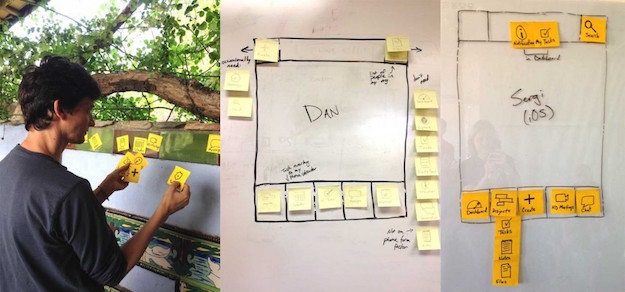
Many of our teammates wanted to fit as many things as possible into the small amount of screen real estate. (We probably taught them some bad habits in the old design, by stacking so many options in the main navigation drawer.) But the most important takeaway from the exercise was the repeating themes or items people kept adding to the main spots. “Chat,” “My tasks,” and “Notifications” appeared over and over again, while “Settings” was the most forgotten element.
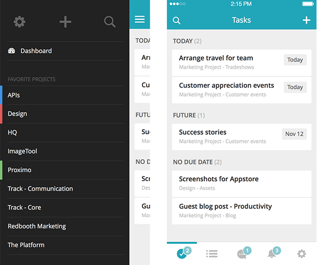
Here’s where we ended up: a 5-tab navigation that feels fully native for iPhone. Our old design was admittedly simple, but in a way, too simple in what it showed and at the same time, too complex by hiding necessary features behind a menu. The new design still feels simple, but in a way that makes the full feature set more immediately accessible.
As we built out the new version of the app, we released early versions to our internal employees to help us validate the new design (and look for bugs). And maybe it shouldn’t have surprised us at all when they said they loved the new navigation — after all, they’d helped design it! But when we made a beta version available for some of our customers to get an early preview, the feedback on the design was also overwhelmingly positive, so we were pretty sure we were on the right track.
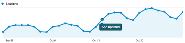
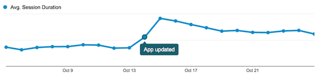
Finally we were ready to release the full redesigned app to the public, and through the magic of Apple’s auto-update, we began to see the changes in our customers’ behavior almost immediately.
The Final Verdict
So what happened?
- Customers used the app more frequently: the number of sessions more than doubled!
- They spent more time in the app: session time increased 70%
- We ultimately saw more customers return, with a 65% increase in daily active users nearly overnight.
When we dug deeper into the data, we confirmed that this was not just because we’d added one new feature. The customers were clearly discovering more of the functionality that had already been available in the previous version, and spending more time interacting with the sections that helped them manage their projects and tasks. With that, we had the proof we needed: the hamburger menu is now banished from our iPhone app, and we’re sure our customers won’t even miss it.
What next? We’ll have to do the same for Android, of course!
Read more about UX at Redbooth: Redbooth’s Timeline View: Gantt Charts Made Incredibly Easy and visit our Gantt Chart Feature page