Making Projects Visual with Gantt Charts
Why visual task management is easier on the brain

Time is continually moving forward; or is it? Many western cultures take the notion of time as linear for granted. The Yupno tribe, from a particularly mountainous region in Papua New Guinea, discuss the future as uphill. The Aymara tribe in the Andes understand the future as behind us. And Mandarin speakers say the future is below us.
While these metaphors vary vastly from culture to culture, they reveal a universal desire to understand time in terms of physical space. Time is abstract. Mountains, currents, and pathways are things we can see, feel, and know in an instant.
These days, when much of office work consists of abstract goals far into the future and products that exist only in cyberspace, thinking of projects as physical objects can make tasks not only more manageable, but more real.
Gantt charts create a visual version of time that meshes well with our natural instincts. In a Gantt representation, projects become lines that span days, weeks, months, and even years. We are able to see not only the destination of the due date, but the path we must take to get there.
This helps us turn the abstract concept of time into a physical resource we can distribute and use to meet our goals.
Doing our brains a favor
Our brains take in visual information more quickly than written or spoken, and remember it better. In fact, image cognition is so fast, we can find meaning in an image in 13 microseconds. A good online project manager lays out a task list in a way that’s easy for our brains to parse.
A basic calendar is one way of putting time to space, but it presents time as static. Intuitively, we know time is continuous, but a calendar forces us to think of events as punctuation marks.
Imagine trying to put a large project, such as a website redesign, on a calendar. You’re the project manager, and you estimate it will take a month to complete, so you create a start and end date on the team calendar, and work your way through the to-do list.
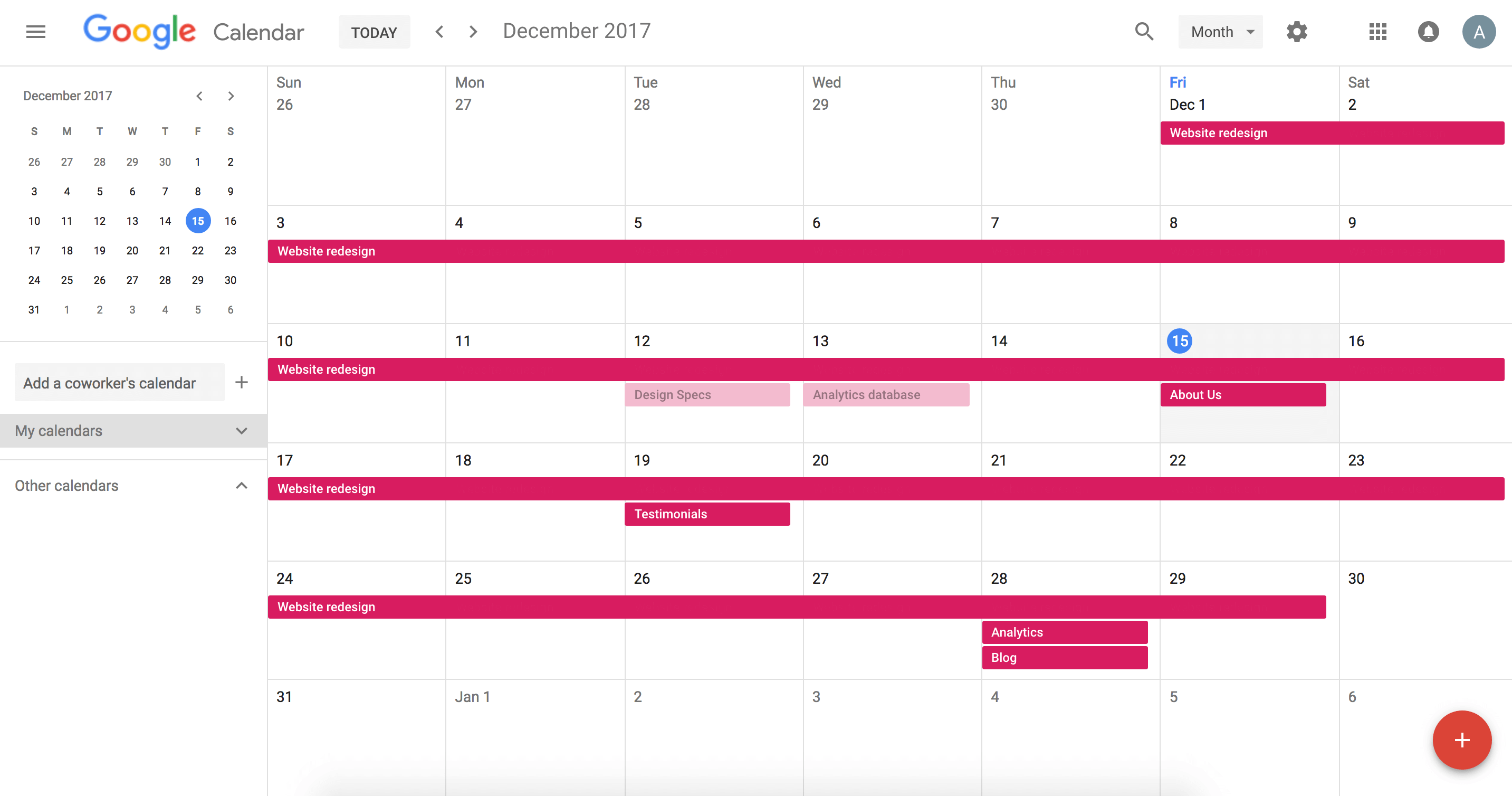
Immediately, inconsistencies appear. There are discreet events for tasks and subtasks. Roles and responsibilities are not defined. There’s no backup plan for when deadlines fail to get met.
A calendar cannot accurately capture how time gets distributed throughout a project. The calendar approach creates more confusion than clarity, and leaves contributors with questions such as:
- How do you know where you really are in every part of the project?
- How do you know when deadlines are missed or moved?
- Who is responsible for what task and deadline?
A better vision of task management answers lots of these questions, while creating a light workload for the brain. A Gantt chart provides cognitive assistance by:
- Breaking big projects down into composite parts so that deadlines are cumulative
- Creating a complete picture of data so that teams can scale projects
- Preventing the silo effect to reduce overlap, increase collaboration, and maximize efficiency
All of these benefits come from the ability to treat time as a continuous span rather than a series of static moments.
A visual task management tool keeps teams and companies aligned on long-term and short-term goals, while taking some of the weight off the project manager’s shoulders. Once you see the different ways Gantt charts make teams more productive, you probably won’t want to plan projects any other way.
Breaking projects down into digestible parts
When you’re undertaking a large project with several contributors, you need to divide and conquer. A Gantt chart gives you a way to break a large goal into individual tasks and track progress in each.
Let’s continue with the website example. Say you’re a small company of around 30 people and you want to update your entire site. The start date is the first of the month and the launch date is set for the 30th. Remaking a website requires input from product managers, designers, engineers, copywriters, and to a lesser extent, everyone else (that About Us section doesn’t write itself!). The Gantt chart shows how it will all come together. First, you have to turn the grand idea of an entire website into a to-do list with concrete deliverables.
Tasks ranging from initial design specs, to blog content, to setting up analytics are assigned. On the Gantt chart, these appear as distinctly-colored progress bars rather than list items, so you can easily follow along the current state of each task.

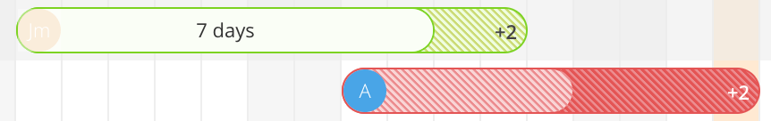
Some tasks can be done concurrently; others will be dependent. For instance, blog posts can be written at any point, up until launch date; but analytics cannot be implemented until pages have been created and the database has been set up. If it looks like the database won’t be ready by a certain date, then the engineer responsible for analytics can adjust task dates in response, and so on. In this way, colleagues can give status updates with minimal communication.
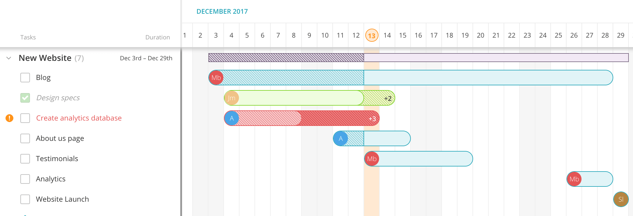
Tasks have their own subtasks and sub-deadlines, breaking down projects even further and making progress bars more accurate. When tasks have been completed, the Gantt chart shows the time it took in relation to the projected duration.
It also shows if certain team members have multiple tasks on their plate on a given day. The project timeline creates context for the parts, showing how each completed task moves the group towards success, and how outstanding tasks slow things down. Late assignments literally “hang over” the next ones.
Arranged in the Gantt chart, deadlines no longer exists as discrete instances, but parts of a whole. It’s much easier to see the cumulative effect of proper task management and how different contributions add up to a cohesive final product.
Creating a complete picture to scale better
A month-long project is significant, but what about goals that span a quarter or a year? Gantt helps teams figure out how to budget time and resources across huge timelines by centralizing disparate data in one place.
Compared to, say, a spreadsheet tool, a visual tool such as Gantt simplifies the overall appearance of tons of information, giving you a summary of tasks in a neat bar chart. It offers a bird’s eye perspective at various levels, from daily, to weekly, to monthly. And while the zoomed out vision offers sweeping views, you can also click on each individual element to see the granular details of a task.
And unlike spreadsheets or other project management tools, the Gantt model is built for multiple administrators, which makes scaling much easier. 20 people can access the chart and adjust their individual responsibilities without corrupting their coworkers’ data. Changes in the project schedule are instantly visible. And contextual conversations can happen in the comments section of each task.
Of course, with a massive project, goals and deadlines shift. Unexpected roadblocks appear. With Gantt, you can view how accurate your timing projections are week over week and adjust expectations. The Gantt chart reveals deadlines that have been moved and tasks that are overdue.
Seeing your progress makes it easy to learn from mistakes and improve management of time and people. This helps project managers and teams scale knowledge in addition to productivity. When everyone is learning from patterns in behavior, teams will see growth across the board.
Preventing the silo effect
The silo effect is when different teams within organizations have no idea what the others are doing, leading to redundancy, or worse, conflict. A Gantt chart slashes this effect by showing how tasks are interconnected within a project.
Going back to the website project, it’s easy to see how the engineers responsible for the site’s architecture and the marketers responsible for the blog content could set up their own goals and deadlines that seem reasonable to each.
In a Gantt chart, tasks don’t stand on their own. While tasks have individual owners and distinct deadlines, they’re projected visually next to each other so you can see the overlap. While teams with different functions will work independently from each other, eventually they’ll have to coincide to make a website that is ready to launch on the 30th of the month.
Connecting tasks visually in a waterfall or stacking effect helps bridge different ways of thinking. When placed on the even playing field of the Gantt chart, marketing and engineering tasks are measured by the same unit. Teams won’t view their tasks as more significant when they see the exact same timeline assigned to another team’s task.
The comparative effect of stacking timelines can be motivating. Teams can see how their progress in one area stacks up against another team’s progress in another area.
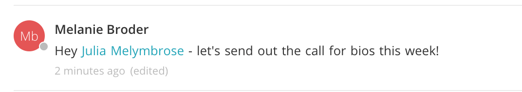
It also helps communication. People can see which engineer, product manager, or marketer is the lead for each task so that they don’t reach out to other team members regarding tasks that they know nothing about.
Silos are unfortunately all too common, if only because people don’t have the time to learn about other departments and ask questions about what they’re working on. The Gantt chart provides a quick reference point that bridges gaps in knowledge and opens lines of communication and collaboration.
Streamlined for success
Gantt charts are a win-win because they increase our understanding of the way we work while reducing cognitive load. We can see our progress and know that we are constantly moving towards our goals.
When time is imbalanced, not used, or spread too thin, the visual guide helps us course-correct. We can treat time as a unit that can be parceled out and stacked up in a way that ensures maximum efficiency and productivity.
Ultimately, a visual plan puts everyone in an organization more at ease. When everyone knows exactly where time is going, the whole team can reach the finish line of a project together.
Sign up for Redbooth and start making visual projects with beautiful Gantt charts today.